Price Transparency
Helping farmers make confident purchasing decisions through transparent pricing data and community-contributed insights.
Farmers were making high-cost purchasing decisions with limited visibility into historical prices, market benchmarks, and what other farmers had actually paid.
Challenge
We created a pricing intelligence experience that helps farmers determine whether a price is fair while building a crowdsourced pricing network that becomes more valuable with every invoice contributed.
Opportunity
Company: Farmers Business Network
My Role: Lead Product Designer
Timeline: 2 Months (2024)
Team: PM, Engineers, Data Scientist & CX
Scope: Research, Data Visualization,
Interaction Design, Prototyping,
& Usability Testing.
Impact at a Glance
3,000–10,000 weekly farmers viewed Price Transparency
2.60% vs 0.33% PDP → order conversion across selected product pages
98.4% upload-flow completion once users entered the flow



My Contribution
As Lead Product Designer, I led the project from discovery through delivery, partnering closely with the Product Manager, Data Scientist, Engineers, and Customer Experience team.
Beyond redesigning the visualization itself, I helped shape the broader product strategy by identifying opportunities to expand Price Transparency into a complete experience, including invoice uploads, locked and unlocked states, member and non-member journeys, and supporting admin workflows.
Through research and usability testing, I evaluated multiple visualization approaches before validating a simplified dot-chart model that improved comprehension while supporting a growing set of pricing insights.
The goal was not only to improve pricing visibility, but also to create sustainable mechanisms that encourage community participation and continuously improve the pricing dataset over time.

Where Farmers Struggled
Comparing products required too much effort: Farmers often had to jump between multiple product pages before they could confidently evaluate pricing options.
Price changes lacked meaningful context: Farmers could see prices but struggled to determine whether current pricing was competitive relative to historical trends.
Long-term pricing patterns were hard to understand: Users needed a clearer way to evaluate pricing across seasons and understand how prices changed over time.
Similar products were difficult to evaluate side-by-side: There was no streamlined way to compare competing products and understand which option offered the best value.
Limited pricing data reduced confidence: Sparse invoice data made it difficult to establish reliable market benchmarks and identify pricing trends.

Key User Groups

Farmers: Evaluate whether prices are fair and make purchasing decisions with greater confidence.
Community Builders (CBs): Use pricing insights to advise and support farmers in the field.
Account Executives (AEs): Leverage pricing transparency during customer conversations and purchasing decisions.
Research & Design Exploration
Before redesigning the experience, I explored several approaches for visualizing historical pricing data.
The challenge wasn't simply displaying prices, it was helping farmers quickly determine whether a price was fair while minimizing cognitive effort.
I evaluated three visualization models: a dot chart, bubble chart, and bar chart. Through usability testing with farmers and stakeholders, the dot chart consistently proved easiest to understand, making it the strongest foundation for the redesigned experience.


Scaling the Experience Across Devices
Farmers access FBN across desktop, tablet, and mobile environments, often switching devices throughout the buying journey. After validating the dot-chart approach, I focused on preserving clarity and interaction across screen sizes without sacrificing critical pricing insights.
The experience was refined to maintain readability, support touch interactions, and surface the same decision-making context regardless of device.

Balancing Access & Participation
Price Transparency relied on a continuous stream of pricing data from the community. To encourage participation while preserving the value of the dataset, I designed a contribution model that balanced accessibility with incentives.
The experience included non-member onboarding, contribution-based access, partial-access states for inactive members, homepage previews, invoice upload workflows, and supporting admin tools. Together, these experiences helped sustain a crowdsourced pricing network that grows more valuable as farmers contribute fresh market data.

Non-Contributors: Preview the value of Price Transparency and submit a non-FBN invoice to unlock pricing insights while contributing to the community dataset.

Inactive Members: Continue to access historical pricing trends, but recent pricing intelligence is reserved for farmers who have either contributed invoices or purchased through FBN within the last six months.

Homepage Preview: A simplified example experience displayed across FBN to demonstrate the value of Price Transparency and encourage participation from both members and non-members.
Impact & Outcomes
Price Transparency evolved from a pricing visualization into a community-powered pricing intelligence experience that helped farmers evaluate products with more confidence.
Impact at a Glance
3,000–10,000 weekly farmers viewed Price Transparency over 18 months
Across selected product pages, chart interaction was associated with higher same-product order conversion
98.4% of users who entered the invoice upload flow completed it
The experience helped turn farmer-contributed invoice data into a growing pricing intelligence network
Key Takeaway
Farmers who actively engaged with pricing insights showed stronger purchase behavior on the same product pages where Price Transparency was visible to both groups.
After reviewing the initial analysis, I refined the comparison to control for product-page differences and Price Transparency availability. In the updated same-page analysis, both groups saw the same product page, the same product, and the same Price Transparency experience. The only difference was whether they interacted with the pricing chart.
This does not prove causation. Farmers who interact with a pricing chart are likely already more purchase-ready. But the pattern suggests that when farmers used pricing data while evaluating a product, they were more likely to continue toward purchase.
The invoice upload flow also showed an important product signal: once farmers entered the flow, very few dropped off. The bigger opportunity was earlier in the journey, improving the transition from the upload CTA into the upload flow.
Beyond improving price visibility, Price Transparency helped turn a data scarcity challenge into a contribution model: farmers could share invoice data, unlock pricing insights, and strengthen the pricing dataset over time.
Purchase Behavior: Chart Engagers vs Non-Interactors
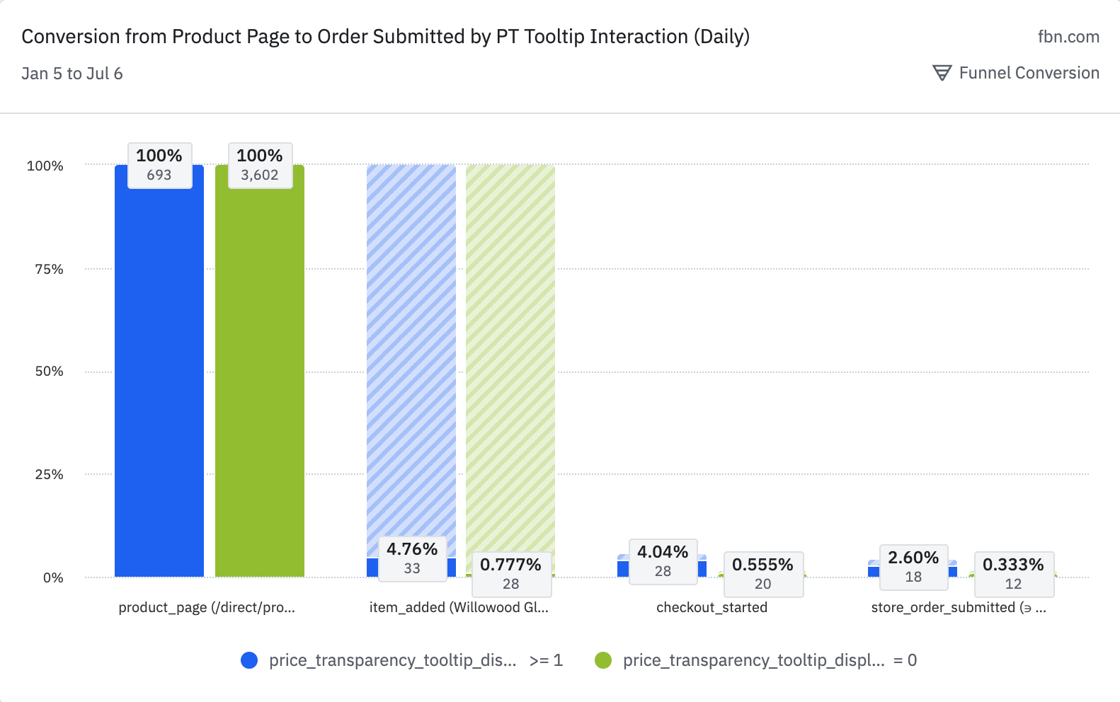
Same 7-day conversion window across four product pages where Price Transparency was visible to both groups. Tooltip interaction was associated with higher PDP-to-order conversion. Directional comparison, not proof of causation.
Across the four selected product pages, farmers who interacted with the chart had 2.60% PDP-to-order conversion, compared with 0.33% for farmers who did not interact.
Want the full analysis?
Includes the full Amplitude methodology, same-page funnel setup, product-level results, and measurement caveats.