Zelle® is a fast and free* way to send and receive money with the people you know and trust. You can find Zelle in the banking app of hundreds of banks and credit unions nationwide. As a product designer I worked on many project for Zelle, and this is one of the project I worked.

ACREPLAN
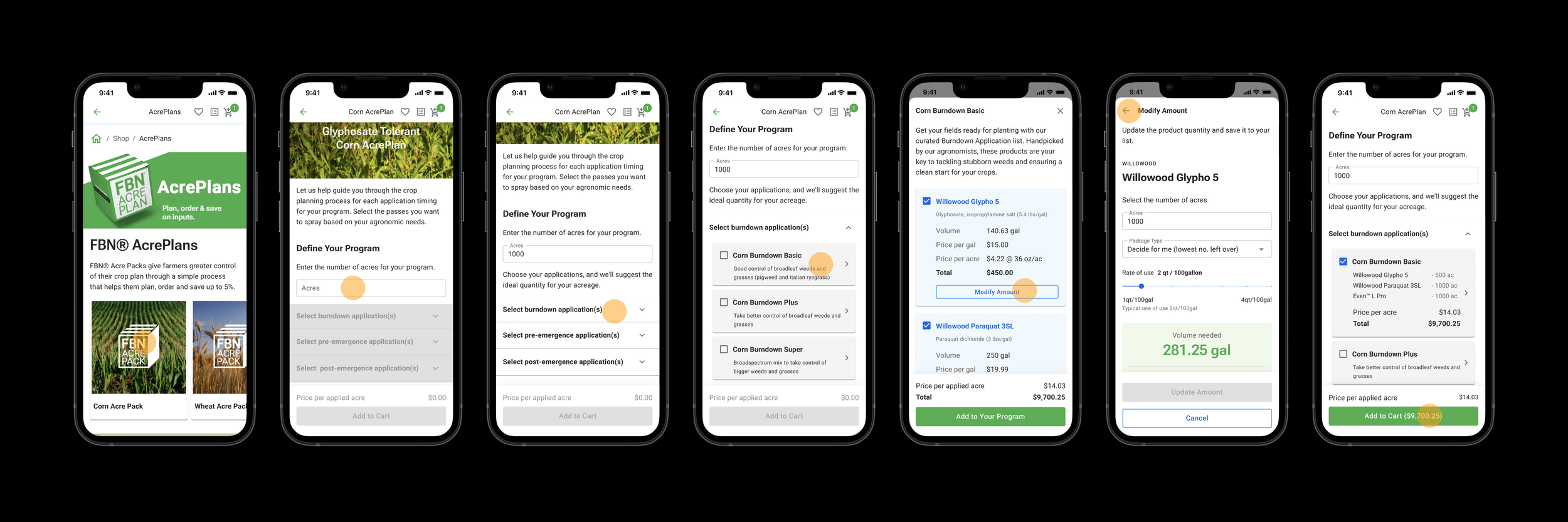
AcrePlan is our comprehensive crop planning tool, starting with users selecting their desired crop. The page is organized by Application Timing, covering key stages like burndown, pre, post, fungicide, and insecticide. Within each section, users can choose between pre-made passes or craft their personalized pass.
Our vision for AcrePlan is to revolutionize crop planning and input purchasing for farmers. We aim to address challenges such as diversifying cart content, aligning with farmers' mental models, and shifting towards selling solutions rather than products. By providing tailored crop-specific packs, expert-curated passes, and transparent pricing, AcrePlan enhances efficiency while offering a customized shopping experience.
My Role
This project represents the second iteration of acrePack, another tool that I had designed the previous year. In response to valuable feedback received during the initial launch, I engaged in extensive discussions with farmers, account executives, stakeholders, and conducted thorough user research. Subsequently, I took on the multifaceted role of designing, encompassing wireframing, interaction design, and visual design. Additionally, I crafted prototypes to visualize the user experience.
Once the feature was in the development phase, I assumed the responsibility of Quality Assurance (QA), ensuring the seamless implementation of the design. Further reinforcing the user-centric approach, I conducted additional user research post-implementation to validate and refine the user experience.


What is the problem we are trying to solve?
The Acre Plans project targets critical issues that require resolution in its next iteration:
Diversifying Cart Content: There is a significant challenge in enhancing the diversity of carts and improving margin profiles for the inputs business.
Misalignment with Farmer's Mental Model: The current planning tool lacks alignment with the farmer's mental model for annual input purchases, necessitating adjustments to better resonate with their thought processes.
Mindset Shift towards Selling Solutions: There is a need to shift the store's mindset, and that of its users, from merely selling individual products to presenting comprehensive solutions.
Stigma of Discount Tool: A discount tool stigma from the previous launch, and a requirement for customers to figure out combinations of products to select despite product organization by crop.
These identified problems highlight the crucial areas that the Acre Plans project aims to address, ensuring a more effective and user-centric approach to crop planning and input purchasing.

Who are our users?
The primary users are farmers, the heartbeat of our agricultural community. Additionally, Community Builders (CBs), independent sales contractors integral to the FBN ecosystem, leverage the tool to enhance product sales and contribute to community growth. Beside them, Account Executives are pivotal in fostering strong client relationships. This multi-faceted approach ensures that AcrePlan caters to the distinct needs of each user group, fostering collaboration and efficiency across the agricultural landscape.
Key Use Cases
To address the specific challenges faced by our target users, we embark on a journey to explore effective solutions. Before delving into the design phase, it is imperative to define core use cases and user stories that align with the needs of our audience and guide them seamlessly toward their objectives.
Farmers aim to efficiently plan crop purchases based on application timing, ensuring precision and timeliness in product usage.
Empowering farmers to select the most suitable pass tailored to their crops and region enhances their ability to apply the right agronomic solutions effectively.
Optimizing the purchase amount of chemicals across all applications is a crucial goal for farmers, seeking efficiency and minimal leftover inventory.
Brainstorming with STACK-HOLDERS
Brainstorming with stakeholders yielded crucial insights that have profoundly influenced our project's direction. Among the key conclusions and requirements identified are the need for tailored crop-specific packs, enabling users to select plans suited to their specific crops. Additionally, users can shop by application timing, benefitting from expert-curated passes for each section. The project incorporates a master acreage field, allowing for default acreage across all passes within the acre plan, along with the flexibility to choose multiple passes per section. Auto-calculated quantities with user-modifiable options ensure a seamless shopping experience, complemented by transparent pricing breakdowns per acre, gallon, and total. Integration of a seamless cart functionality further enhances the user experience, ensuring our project meets the diverse needs of our users and provides a customized shopping solution.
How does it work?
During our brainstorming sessions, we identified key insights for enhancing AcrePack, which we rebranded as AcrePlan. The concept revolves around empowering users to select a plan tailored to their specific crop. For instance, if a user chooses corn, they are directed to a dedicated planning page where they input the acreage they are working with. This allows us to calculate the required quantity of each product at the standard rate.
Next, we activate relevant sections based on the application timing specific to the user's needs, whether it's burndown, post-emergence, or pre-emergence. If users opt for burndown applications, they are presented with a curated list of products tailored to their crop selection and acreage. They can explore each item individually, viewing the recommended quantity for their acreage, and adjust as needed.
Once they have finalized their selections, users can return to the main page to add additional applications before proceeding to the checkout to complete their purchase.
Here is the link to the tool on FBN website
Farmers using AcrePlan to buy products recommended by experts.
User Research Insights:
As part of this project, comprehensive user research was conducted to ensure the efficacy and user satisfaction of the AcrePlan tool. The research aimed to validate the solution's ability to address user needs, assess its user-friendliness, and identify areas for improvement.
Post-Design Feedback:
Following the completion of the design phase, in-depth discussions were held with 4 farmers and 3 Account Executives (AEs) to gather feedback. The majority of farmers expressed satisfaction with the expert-curated lists provided by AcrePlan. Notably, only one farmer indicated a preference for the ability to customize or build lists from scratch. Overall, the response to AcrePlan was overwhelmingly positive, affirming its alignment with user expectations and needs.
Post-Launch Evaluation:
Approximately one month after the tool's launch, feedback sessions were conducted with 8 AEs to evaluate their experience with AcrePlan compared to its predecessor, Acre Pack. The majority of AEs expressed a preference for AcrePlan over Acre Pack, citing improved usability and alignment with farmers' needs. While one AE expressed a desire for customization options, most respondents indicated satisfaction with the recommended products and rated the tool's user-friendliness highly, with an average rating of 4 out of 5.
When asked to compare their preference between the old and new versions of the tool, the majority of respondents favored AcrePlan. However, two respondents expressed a preference for a hybrid approach, combining elements of both solutions.
Future Research Plans:
Looking ahead, further research is planned to gather feedback from farmers regarding their experience with the new tool. This ongoing commitment to user feedback underscores our dedication to continuously enhancing the AcrePlan tool to better serve the needs of our users and ensure a seamless user experience.


How Did we measure success?
In evaluating the success of AcrePlan compared to its predecessor, Acre Pack, key metrics such as:
Increased products per checkout
Higher repeat purchases
Improved planning experience,
Shift towards self-service checkout
were considered. Graphical representations, including a doubling of products added to the cart, effectively highlight AcrePlan's significant success over Acre Pack.


Take Aways
In summary, the AcrePlan project shows how listening to users and making small improvements over time can create successful digital tools. By prioritizing user feedback and engagement throughout the design and development process, AcrePlan was able to address specific pain points of farmers and AEs, resulting in a highly positive reception post-launch. The balance between expert curation and some modification options, coupled with a strong focus on usability and user-friendliness, contributed to the tool's preference over its predecessor. These findings highlight the value of ongoing user engagement, data-driven decision-making, and a commitment to continuous improvement in driving the success of digital projects within the agricultural landscape.
Bill Pay Project
With Bill Pay, customers can use Zelle® to make fast, safe and easy payments to nationwide billers directly from their bank app or from the biller’s website. Zelle will build on the credibility it has already earned and leverage the established Zelle network to improve the way money moves.
Biller Direct and FI Bill Pay are the two well-established digital payment models.
My Role
I led the design of the Bill Pay Project from initiation. I worked on ideation, research, competitor analysis, storyboarding, design, and prototyping. In addition, I worked with a Usability Researcher, a Content Strategist, two Product Managers, and a team of Engineers.
Part 1: Zelle Biller Direct
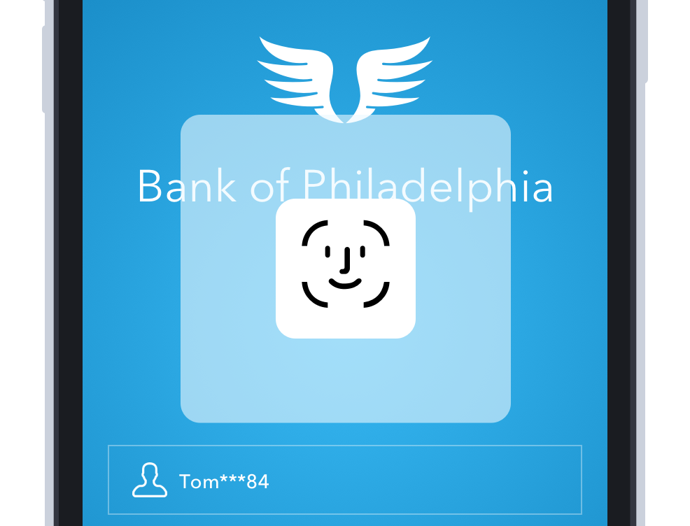
With Zelle Bill Pay, customers can pay their bills online without sharing sensitive bank or credit card account information. As always, Zelle transactions are fast, safe and easy. Users simply log into their biller’s website or mobile app, select the bill they want to pay, choose the Zelle payment option, enter their email, U.S. mobile number, or the Zelle tag that they use for payments, and they are confident that their payment will made. Funds are immediately deducted from their checking account and sent to their biller.
Zelle Bill Pay allows customers to keep their sensitive information safe by sharing only their U.S. mobile number, email or Zelle tag with billers.
Account setup is easy - no need to look up and enter their checking account or credit card numbers. User simply enter their email or U.S. mobile number.
Zelle Bill Pay provides instant payment credit and confirmation.
Zelle is a trusted brand backed by the nation’s largest financial institutions.

WHAT’S THE PROBLEM WE’RE TRYING TO SOLVE?
Of the 15.5 billion annual bill payments in the U.S., 38% percent are still paid offline. and 62% paid online. People still pay their bills in many ways, and while this varies by generation, even Gen Z’ers are paying 16% of their bills by mail. Overall, offline bill payment accounts for 2.3 billion checks written annually, with the balance of offline payments being made via phone and in-person with cash and money orders. Considering nearly everyone carries a smartphone, this percentage is shockingly high.
Over the past decade, Biller Direct has emerged as the preferred model and now represents 76% of digital bill pay volume. That said, both models (FI Bill Pay & Biller Direct) have their long-standing challenges.
According to Fiserv (a Zelle reseller), customers also cite concerns about late payments and managing cash flow with 35% paying a bill after the due date and 65% of those incurring a late fee over a year. Given these numbers, it’s no surprise that people expect their payments to be credited to their accounts quickly – 42% say within minutes and 39% say by end of the day.
The current bill pay ecosystem has several pain points for billers as well. During our research, billers cited a desire to reduce returns, improve funds availability (mid- sized businesses), reduce customer calls to confirm payment has been received, and reduce processing fees/costs. Billers also cited a desire to “increase customer retention through a ‘delightful’ payment experience,” and meet their customers’expectations for real-time payments.


Most Common Reasons for Intent to use Zelle Bill Pay
Highlights FROM THE CONCEPT TESTING
The Zelle Biller Direct Bill Payment concept is favorably received by all generational audiences and should be considered suitable for launch.
▪ Among target consumers, Zelle Biller Direct outperforms Early Warning’s normative concept testing benchmark on the key call-to-action metrics of Overall Likeability and Believability.
▪ Performance ratings for the concept are generally favorable across Gen X, Millennial, and Gen Z groups, but falls short with the Boomer cohort as consumers in this group perceive the Zelle Biller Direct concept less favorably.
▪ Of those that use auto-pay services to pay recurring bills, 53% would be likely to switch these payments to Zelle Biller Direct.
▪ In open-ended responses, participants most often cite convenience and safety/security as top reasons behind higher Intent to Use scores for the Zelle Biller Direct service.
Who are our users? What do they need?
1- Our target Customers are individuals that intend to use Zelle to pay bills from biller’s websites. Customers use ACH (Account/routing#), checks or debit cards to make these payments.
2- Our target Billers / BSPs want to offer comprehensive and innovative payment options including the ability to Pay with Zelle. Zelle is a trusted brand backed by the nation’s largest financial institutions and can become a method of choice to pay bills (in addition to offering a lower cost compared to credit card transaction fees).
3- Financial Institutions benefits:
Brand engagement: On a regular basis, consumers will use their banking credentials to do more than to log into their accounts to view balances and transactions.
Innovation: Financial institutions gain another value-added consumer touchpoint to increase their relevance in the lives of their customers. FI customers can use the service regularly to conduct additional aspects of commerce, deepening the relationship and increasing the importance of the FI providing the innovation.

U.S. Bill Pay Volume by Method
Storyboards
After this research, I worked on a series of storyboards with our persona, “Tom” and the fictitious utility company, Phily Power Company. Collaborating with our Content Strategist and our PMs, we created scenarios which conveyed how Tom was able to pay his bills with Zelle. Through these storyboards (without delving deeply into the details of the high-fidelity wireframe & prototype), we wanted to capture attention, provide clarity, and inspire teams, stakeholders and particularly FIs, to take engage.
Tom Evans: A bachelor and teacher living in Philadelphia. Tom has been using his mobile phone more and more over the past few years to manage his finances and to pay his bills. Tom typically uses mobile apps (instead of mobile browsers) to transact with financial institutions and companies.
Phily Power Company: An U.S.-based investor-owned utility based in Philadelphia, PA. Philly Power Co. provides electricity to a majority of the population of northern Pennsylvania.

How does it work?
Paying bills with Zelle is fast, safe and easy. When setting up payment method or adding different payment options within the biller’s website, customers can select Zelle. Then, customers provide their Zelle “token” (U.S. mobile number, email or Zelle tag). Behind the scenes, billers validate the ownership of this token, by sending a request to the customer’s FI (via Biller FI) for payment authorization. Then, the biller validates funds availability at the customer’s FI and the biller receives payment processing notifications. The FI’s have to authenticate the biller, process payment request (accept or reject), and ultimately send payment information to Biller’s FI.
In order to illustrate the process more clearly to our partner FIs and billers, I designed and created a fictitious mobile app, “Soleil”. Soleil is wireless company that offers Zelle as a payment method. In this fictional scenario, our persona, “Tom”, uses Zelle to pay his “Soleil” wireless bill. When developing the Soleil app, I collaborated with engineers and PMs, working on each scenario and prototype.

Adding Zelle as a payment method
Usability Research
We designed two different solutions for paying bills via the biller’s website. In Solution One, the user will exclusively use the biller website. In Solution Two, the user will begin the process within the biller website, but then is redirected to their bank app. The goal of the research was to understand which solution was easier: (1) bill pay setup/paying a bill OR (2) setting up autopay. Also, we wanted to gather feedback regarding customers’ expectations for a bill pay product offered by Zelle. As well, we included a survey to gather this information.
We recruited 60 participants on UserZoom for an unmoderated usability test. Our test group included: 20 participants for only Solution One; 20 participants for only Solution Two, and 20 participants to go through both Solution One and two.
Below, you can see the prototypes for Solution One.

Setting up Zelle as payment method.
In this prototype, user will set up Zelle as a method of payments.
Authenticate to the bank in order to approve a payment
In high risk situation, user needs to approve a payment through their bank app.

Zelle is a default payment method.
Zelle is set up as a default payment method. User will see the bill, sets up the auto-payment and pay his bill
Usability Research Take Away
Overall, there were no usability issues for setting up Zelle as the payment method in Solution One.
People who preferred Solution One, commented that it was “easier, faster, and they didn’t like switching between apps”. (biller -> bank). Those who preferred Solution Two said it felt more secure.
Solution One ranked better than Solution Two compared to auto-debit for both setup and payment.
When asked why Solution One was their preference, they responded:
“I prefer Solution One because I don’t have to leave the biller’s app and it seems faster.”
“Easier to make sure it’s all done in one place. It feels cleaner without having to go back and forth.”
“The Solution two took too long and had a lot of unnecessary steps.”

Zelle® is a fast and free* way to send and receive money with the people you know and trust. You can find Zelle in the banking app of hundreds of banks and credit unions nationwide. As a product designer I worked on many project for Zelle, and this is one of the project I worked.
ZRF Project
Zelle® has partnered with leading banks and credit unions across the U.S. to bring you a fast, safe and easy way to send money to friends and family. Money moves quickly - directly from bank account to bank account.
ZRF or Zelle Ready Friends is a project to help our consumers identify other users in the network and transfer them money instantly.
My Role
Lead end-to-end design through research, wireframing, interaction design, visual design, prototyping and cross-team collaboration.


What is the problem we are trying to solve?
Currently for a Zelle consumer or small business user, when sending or requesting money, there is no easy way to find which contacts within their contact list is already using Zelle. Also, if a contact in the user’s phone has multiple Tokens (email address / U.S. mobile number), it is a challenge to find which specific Tokens are enrolled in Zelle..
In order to solve those problems, the profile picture/avatar of the contacts with active Zelle Tokens will be highlighted with the Z logo. This will help the user to quickly identify all of the Active Zelle users from their contact list and also which Tokens are enrolled.
Who are our users?
Originally, we defined our users as Consumers and Small Business owners. However, after working on the Bill Pay and Charitable Donation projects, I saw the need to expand our scope by offering the same solution for them too. Meaning we use Z logo as an indicator for big billers and charitable organizations.


For the avatar of 120x120, this is how the need to implement the Z logo.
Design, Patent & Implementations
I tried many indicators, however, the Z logo was the best. How to add the Z logo above the avatar initially presented a design challenge. To adhere to brand guidelines, the Z logo cannot appear inside the avatar’s circular format, so the Z logo had to be redesigned to work harmoniously with the circular avatar format. After receiving approval for this design approach from Legal and Marketing, we patented the design.
Additionally, we had to consider how to instruct engineers from each FI on the implementation of Z logo correctly. Ultimately, I worked with a front-end engineer and together we found a way to do so. Our front end engineers for both iOS and Android, prepared some code beside instruct the engineers who had refused to use our code.
Universal Z Logo
Initially, the idea was to place the Z Logo only on the recipient screens, as it was helping our users. However, after additional thought, I concluded that it would be much better to look at Z logo placement holistically and ultimately add it everywhere with each profile photo. In fact, Z Logo placement throughout the payment flow provides added confidence to the sender, easier findability, and resonates with them more.
By seeing the Z logo prominently featured repeatedly, the user would grow more confident seeing the Z logo associated with other projects, including Bill Pay and Charitable Donation. Specifically, by seeing the Z logo above the avatar of other well-known billers like Verizon and Red Cross, it could clearly convey that the user can pay their Verizon bill or donate to Red Cross instantly with Zelle.
How does it work?
While Sending, Requesting or Splitting money, the first step is to find the intended recipient within the Zelle app. The recipient could be one of the contacts to whom the sender has previously sent money or can be someone new.
While sending money to someone new for the first time, Zelle Ready contacts will come in handy. Zelle searches the entire phone book contacts of the Sender and creates the Zelle Ready contacts list to make the recipient selection process quick and easy.
When sending money to a previous recipient, the Zelle enrolled indicator reassures that the recipient is enrolled and still active in Zelle.

Send Flow: Sending Steve Rogers, $50.00
All Contacts or Only Zelle Ready Contacts?
Before we enable the ZRF project, on the “Select Recipient” screen, the user would see “Recent Recipients” and “My Recipients”. My Recipient will include everyone that the user has send money to, either adding them from their phone contacts or adding them manually. Now, with Zelle Ready Contacts, we want to show the other group of enrolled Zelle Ready Friends to the user. The challenging question was to show only Zelle Ready Contacts, or everyone from the contact list. Given that a user can send money to non-enrolled Zelle users, which we did not want to prevent users from sending money to. My personal assumption was that user would prefer to see only Zelle Ready Friends, but we wanted to confirm this assumption.

Select Recipient Page, includes: Recent Recipient, My Recipient and My Zelle Ready Contacts!
In order to see which option was the best for the user, I created two designs for “Select Recipient” screen. In the first design, users were able to view :
Recent Recipient
My Recipient
My Zelle Ready Contacts
In the second design, users were able to view:
Recent Recipient
My Recipient
All Contact (Zelle enrolled user and not enrolled one)
One more thing that I added; in both design, while the user is searching for a name, the results would show both enrolled and not enrolled users.
Then we tested both of these design options. We put both designs in front of users; first, asking them to send money to someone who was enrolled in Zelle, and then asking them to send money to someone who was not enrolled.
Usability Research Take Away
When shown both prototypes, users understood the difference, and expressed a strong preference for the Zelle Ready Contacts version. There was a large difference between the number of people who wanted all contacts vs. only Zelle users. Most people are in favor of displaying only Zelle users.
Many users thought the version with All Contacts was too long, and this list only contained 170 tokens, which is less than the average person.


What’s the vision?
Increase overall customer satisfaction with Zelle
Unified Zelle experience – Z logo is mandated for all FIs
Influence customers to use Zelle for all their payment needs by showing the power of the network through Zelle enrolled status indicator and Zelle Ready Friends list
Be competitive in the payment space by offering this new additional feature
How will we measure success?
Reduction in $1 test payments by 50% - currently Zelle customers do $1 test payments when they send money to someone new for the very first time.
Reduce expired payments by 3%
Reduce the Send Money drop rate by 5%
Going to the Market
ZRF is a mandatory feature to all the participants – by October 2021. We have published the feature in FIUX guide, Tech Spec for the new API, Zelle Network Standard Terms update with October 2020 Network Publications. Currently, Chase Bank and Bank of America have adopted this feature as a pilot and soon the remaining FIs in the network will follow.


What will be My next step?
This may appear to be a finished project, but it is not. I don’t believe that any tech project is actually ever finished. There is always room for improvement, which can always enhance the user experience. We need to work on increasing the amount of user’s transaction, while also reducing the number of misdirected and expired payments. Presently, I’m working on those ideas. While on this project, I developed a better working relationship with members of the Engineering and Product teams as well as the many designers from our partner FIs.

CISCO WEBEX APP HUB
The Cisco Webex App Hub is a hub to discover integrations and bots to use with the Cisco Webex Teams app. When I was working at Cisco I was the lead UX designer for this project and beside designing Cisco Webex App Hub, I also had the pleasure to design Bots & Integration feature at Cisco Spark (Cisco Webex Team). Here are how did I work on them. (San Francisco, 2016)
Cisco Webex App Hub Flow Diagram
For this project, as any new project I get, I did some research first and I checked what were competitors doing,… And tried to understand what is the best solution for the user, how we can improve and make it easy and fast. Then I talked to Product managers and engineers about my research and competitor analysis and layout for them my solutions, and engineers provided what they can do considering our time frame. After that, I started to work on a high level flow diagrams, (Above is an example) and see for instance if a user want to add, remove or modify an integration how many steps he needs to take and what they can do.

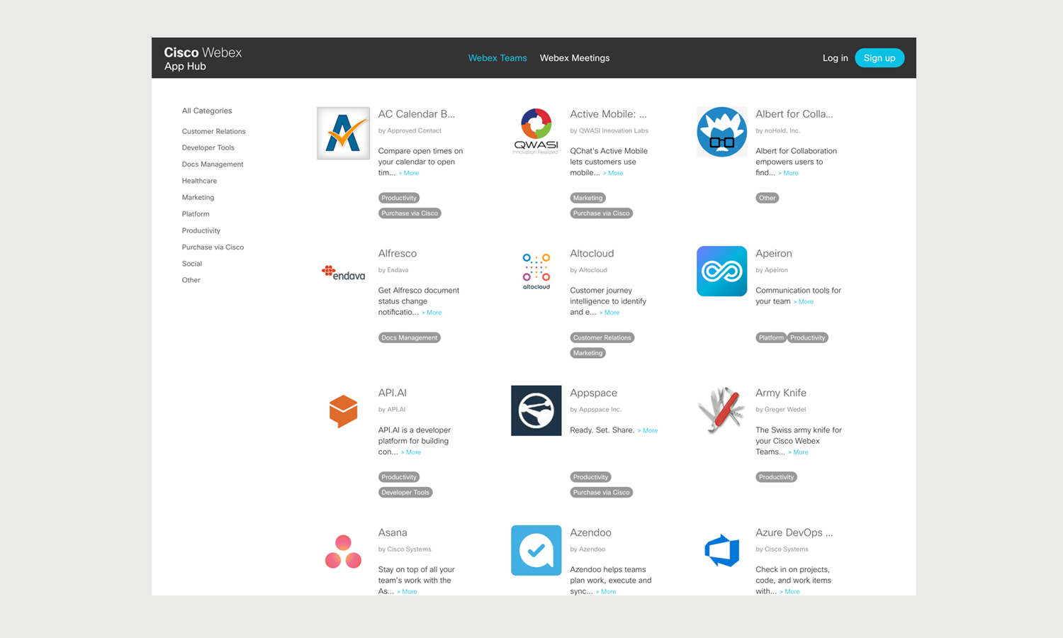


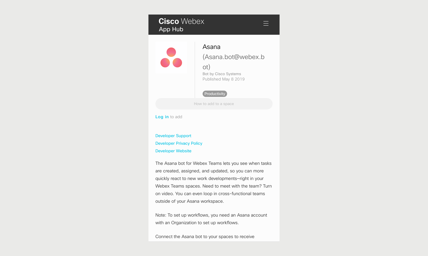

CISCO WEBEX APP HUB Website
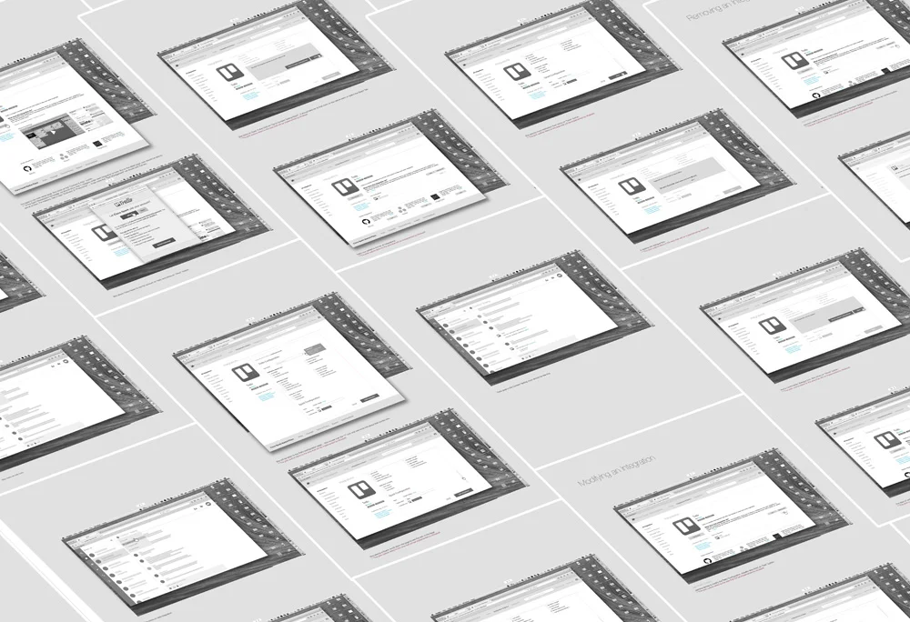
Part of my this project was to build the market place website,… Again talking to stake holders I designed the website,… This pdf file shows in more detail the mockups and flow.
In the pdf. I showed how user can add an integration via Webex room, does the configuration on the App hub website, how she can modify and remove an integration.
Also how Bot page should look like, how user can access to bot’s categories, add or remove them.
Cisco Webex Mobile Web
Beside the web version of the app hub website I needed also to consider the mobile web version (responsive) of it. Here you can find with details, how user can access the app hub via her mobile and add, remove or modify an integration or a bot.
These are some samples of the current website that still based on my design for App Hub.
And here you can see check it out.
Bots
Bots was a fun feature to work on while I was at Cisco. Since Bots are one of the main avenues to automate tasks in a product, it was important Cisco Spark has this feature specially from competitive standpoint against Slack or Hipchat. The goal here was to create a Bots API so developers inside or outside of Cisco can build bots for the Spark platform (Cisco Webex Team).
For this project, after talking to some stakeholders, I did some competitive analysis on Bots in different apps like Slack, Hipchat and Telegram.
Then I started to dig more into details, how we should build our platform? What're the specifications, How many type of bots we should have? & …
Working on this feature has it’s own challenges, the biggest one was how to create a user friendly bot that every one enjoy working with and not get confused.
For Bots, we had two type of users; the external engineers and consumers ( normal users). So the question was how we should make the path for both of these type of users.
After defining all those details, I worked on an imaginary bot, called it Weather Bot. It was extremely simple. The goal was here to build a platform that provide enough ground to external engineers in order to build their bot as user friendly as possible.
These are the wireframes on how to add a bot to Cisco Spark Mobile App.

Cisco Webex Team (Cisco Spark)
For three years, I was lead UX designer for the different features in the Cloud and Mobile Collaboration team at Cisco, specifically for “Content Sharing”, “Meetings” and “Marketplace (Integrations & Bots)” for both mobile & desktop client, creating flow diagrams, wireframes & prototypes. I worked with product managers to determine the phasing of upcoming features across multiple platforms and devices and closely worked with engineers as the projects being developed, delivering necessary annotations/design specifications.
Content Sharing Flow Diagram
Before I start working on sketching and ideas, specially when a big projects comes to me that I need to understand and think through the details, I always like to create a flow diagram for it. It really helps me to understand and design it better. It also provides a better picture for the engineers team while they are building their system. When I started my job at the end of 2013, I was chosen to work on Content Sharing feature of a new app called Cisco Spark (Now Cisco Webex Team). After talking to stakeholders I started to work on this flow diagram. All the light blue elements on the flow above means we should to have them in the future and all the darker one have to have them for the release.


Sharing a photo or a File
Here are a pdf file that shows how I designed sharing photo or document via Cisco Spark app. (San Francisco, 2014)
And this document shows how did I design it for web and desktop app.
Content Library On Mobile App
These are some quick sketches of three ideas I had for Content Library in Cisco Spark App. (San Francisco, 2015)
Content Library solutions
Here are the digital version of the sketches above. (San Francisco, 2015)
blah blah blah 3eudu
Looking With …
“Looking With … “ is my photoblog that take in the sights with fellow humans from around the world. I believe no matter where you are coming from, where you are going to, or what you are looking at, it is a comfort to see someone else looking with you at the same thing, appreciating the sense of beauty the same way you do. If you have your friends or family with you, then you can share your feelings about the scene, talk and laugh about it, or even discuss it from different angles! And if you are alone, even a stranger beside you makes it more real,.... Although time may pass without exchanging any words.
On June 2007, when I was visiting the big citadel in Bosancan I saw a lady sitting on a bench looking at the view in front of her. The view was magnificent so I grabbed my camera and looked at it through my lens. I noticed the view was not quite as beautiful without the lady herself in it! So I took the shot with the lady taking in the view with me.
That made the first shot of a big series of photos I started since then. By sneaking behind people without their knowledge, sometimes asking their permission and even their name, I started gathering photos little by little for my project LookingWith.com .
I designed my photpblog in 2012 from the scratch and a friend helped and built it.
This is how all the mouseovers on the homepage look like.
Every photo I take I assign to it the location of the photo and user can click on Map button in order to see where was it taken.
This is how “About” page looks like.
If user clicks on “Add Comment” this form will show up.
A mouseover behind the logo on the top of the page which explains about the photoblog and the idea behind it.
And the overview page.
The “Contact” form.

Mindjet Maps
I have worked for almost two years as Senior Visual Designer at Mindjet. I was responsible for the visual design of all Mindjet products e.g. desktop, web, tablet & mobile. My focus was on designing engaging and innovative end to end user experiences using unique visuals across the entire product line. I enjoyed creating flow-diagrams and high-fidelity mockups as part of the user experience process, defining a consistent visual language throughout the product and preparing detailed visual design specifications using visual style guidelines.
Mindjet had 2 different product, one was Mindjet Maps which was a mind mapping tool and the other one was Mindjet Tasks which was a task management application. This is a document that shows how were looked like before and after.
In this page I will try to explain my project while working on Mindjet Maps.
When I started my position at Mindjet, they were trying to merge all users for both products. Although I was hired as senior visual designer, because we didn’t have enough UX designer in our team I started to work on UX too and I created this flow diagram to help engineers build the backend and drive all the user to right place. (San Francisco, 2012)


Mindjet Login Page
Here are some screen on how the Mindjet sign up or login page looked like. (San Francisco, 2012)


Minjet Maps
A new look and feel that I designed for Mindjet Maps (San Francisco, 2013)


Android App
Here are some examples of Mindjet Map app for android after the redesigning the look and feel of it. (San Francisco, 2013)


Email Notifications
Some examples of email notifications for Mindjet. (San Francisco, 2012)


Much Modern Map
Another more modern looks of Mindjet Maps (San Francisco, 2013)
blah blah blah 3eudu
Mindjet Tasks
Mindjet tasks was a social online task management service that provided groups of people a more dynamic and effective way to communicate on projects and get work done. When I joined Mindjet in 2012 there were trying to build the mobile app of this product and a colleague and I worked on the design of this app.


Mindjet Tasks App
Here are some pages of Mindjet Tasks app,… I tried to work on a flat design and get away from the 3D look and feels of the app at the time. Here is a pdf file of my work that shows how the Mindjet apps looked before I work on them. (San Francisco, 2012)
Mindjet Tasks App
While working there I also worked on Mindjet Tasks App for iPad. I worked as UX designer and created wireframe. Here are some pages of the mockups. (San Francisco, 2013)
Mindjet Taks app Story Board
A storyboard of the iPad app.. (San Francisco, 2013)
blah blah blah 3eudu
Roche Web Projects
I worked for Roche, for almost 4 years. I started as an intern as part of school program, then quickly hired as visual designer and promoted to Art Director. While I was working there, I was responsible for overall digital design (Public-facing websites, iPad & iPhone apps, mobile web, newsletters). UX & UI designing for mobile apps. Quality controlling of global websites targeting various cultures. Ensuring adherence to corporate guidelines & legal requirements. Gathering client requirements, interface with project managers, internal & external design agencies & engineers. Budget forecasting, resource management, create design processes & guidelines.
Below are some portal and website sample that I designed.


Roche malaysia
I designed some pages of Roche websites for our affiliates in Malaysia. (Malaysia, 2011)


Infocancro
Infocancro was a patient website for Roche affiliates in Italy. I had to design it in a way that it is flexible enough so other country can use the template, change the color and content. (Italy, 2009)


Map Assist
Roche affiliates in London needed a patient website to encourage their user to eat healthy food and exercise. (UK, 2008)


Mabthera Patient Website V2
German affiliates wanted a patient website for Mabthera. Patients could use it in order to get information about the medication. (Germany, 2011)


Mircera
Mircera is one of Roche product. I worked closely with the Product manager in order to build the website. (Switzerland, 2008)


Avastin
Avastin also is one of oncology product. They had a strong branding and I worked closely with the product manager and our team to build the website. (Switzerland, 2010)


Sweden Oncology Portal
This project was huge and I had to design an oncology portal that worked for physician, patients and also media. (Sweden, 2010)


Genentech
I worked on a few pages for Genentech website while respecting their guidelines. (USA, 2010)


Mabthera Patient Website V1
German affiliates wanted a patient website for Mabthera. Patients could use it in order to get information about the medication. (Germany, 2011)


Avastin Global Page
For the Avastin website we needed a global page in order to redirect our user to their own country website.


RAPPort
Mabthera-RA is one of sub product of Mabthera. They wanted to revamp their website so here was my proposal using their branding color. (Switzerland, 2009)
Roche Mobile Projects
I worked on a bulk of projects at Roche where I worked closely with product managers, project managers and engineers. The mobile app projects included …..
CongressUs
CongressUs is an app for physicians to see the session of interest for congresses they are attending. The session have been reviewed and rated by a board of expert and key opinion leaders. This story board above shows my wireframe and the flow of this app. (France, 2010)
And these images shows how they looked like after I worked on visual design based on the branding guideline.
GFR Calculator Wireframe
An app for physician to help them calculate the right amount of Mircera doses for their patient. I worked on the wireframe and the interaction side. (France, 2011)
MabApp
Another small calculator app for Physician to help them calculate the right amount of drug doses for their patients. (France, 2011)
This is how it looked after a visual designer worked on it.
This is how it looked after a visual designer worked on it.
Xeloda & Herceptin Calculator
This is also a calculator for physician in order to help them with Xeloda & Herceptin doses for their patients.
And these are some screen examples after I worked on the visual design for the app icon and pages using Xeloda branding colors and visual elements. (France, 2010)
3eidi
3eidi was a personal project that I started in 2001. “3eidi” in Persian and Arabic means “Present” or “Gift” that you get for new year from family and friends. Retrospectively, there was a lack of digital Persian New year (Norouz) greeting cards at the time, so I decided to create a unique e-card every year. For that reason, every year, at the last month of the year, I focused on an idea such as a story, music, animation or movie, and worked with new tools and technology in order to build these cards. I wanted to make a special greeting card that reminded us of the Iranian new year and it’s ambiance. It was challenging, but very rewarding too as I learned a lot while working on this project.


Norouz Tu Rah-e
Song in the clip is “Norooz Tu Rahe” by the artist Samin Baghtcheban, from the album “Rangin Kamoon”. (France, 2009)

The Journey of Red Fish
Music by Hossein Alizadeh (Iran, 2006)

Creation
Music by Parviz Rahman Panah, Illustration by Mahmoud Farshchian and Poet by Ferdowsi. (Iran, 2003)

Sabzeh
The music in the clip is “Songs of Compassion / Search” and “Songs of Compassion / Life” from the album “Ney Nava” by Hossein Alizadeh (France, 2011)

Preparing Haft-Seen
The song is “Naghmeh-ye Noroozi” (Ruhollah Khaleghi) and the artist Hourieh Tahmassi. (France, 2008)
Haft-Seen Stroy
Music by Nadereh Salarpour. (Iran, 2005)


Bahar Amad
The calligraphy by Mehran Shirali, Poem by Rumi. First song “Bahar Bahar” by Hayedeh, Second song by “Sorrowful Spring” by Mahsa & Marjan Vahdat, Atabak Elyasi and the third song: “Bahar Amad” by Houshmand Aghili. (Iran, 2010)

Dance & Creation
Music by Hossein Alizadeh. (France, 2007)

Dance
the music is “Dota Cheshme Siaah Daari” by Fereydoun Foroughi. (Iran, 2004)

Bad-e Saba
Music is “Eshgh” by Golpa and the poet is Hafez. (Iran, 2001)

AICTC Web Projects
I worked at AICTC (Advanced Information & Communication Technology Center of Sharif University) for almost 5 years. I started as a Visual Designer and became the Art Director a few years later. I was responsible for the overall design and quality control of various websites. I gathered client requirements and worked closely with our product managers and engineers.
Below are a few samples of my projects.
Leasing Khodro
Leasing Khodro website (Iran, 2006)
Old Persia
Old Persia website, Version 1 (Iran, 2004)
IMIDRO
Iranian Mines & Mining Industries Development & Renovation Org. Portal (Iran, 2005)
Old Persia
Old Persia website, Version 2 (Iran, 2004)
AICTC E-learning
E-learning Portal (Iran, 2004).
Kowsar Mining
Kowsar Mining website (Iran, 2003)

Small Personal Projects
The projects on this page are mostly personal and I have had some contribution from friends and family.
Royal Lily Logo
A friend started a business (Lingeries & Nightwear) and asked me to help her with the design of the logo. (UAE 2019)
Wedding Invitation
My brother’s wedding invitation. (Iran 2012)
University Project
I have made these posters & website for our “Rhizome” project, Adulte D’Origine (ADO), which is about interactive experience on the theme of psychology! (France 2007)
Bormate Logo
My sister needed a logo for her bakery. I designed this cake shaped logo. (Iran 2014)
UNIVERSITY Project
I have made this poster for our Marketing project, my subject was anti-smoking, and we have to make it in old fashion style (France 2007)
University Project
“Une chasse pas comme les autres” was the name of our scenarisation project in university. We had to write a story, design the character of our story, create story book, and a game for it. Attached is the book and the next one is the guide to our project (Montbéliard – France 2006)
Book Cover
Cover-book for a friend. The book was about ethnicity and the commitment for democratization. (Iran 2017)
University Poster
I made this old fasion anti-smoking poster for our marketing project. (France 2007)